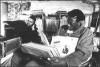
bart5 Posted January 3, 2006 Report Share Posted January 3, 2006 (edited) I haven't drawn in a while, but I like the way this turned out. Let me know what ya think. Thanks for looking. Picture I based my drawing after: From the He's The DJ, I'm The Rapper cd booklet. Edited January 4, 2006 by bart5 Quote Link to comment Share on other sites More sharing options...
Jonny 5 Posted January 3, 2006 Report Share Posted January 3, 2006 more dope work Bart! impressive... Quote Link to comment Share on other sites More sharing options...
cristigolo Posted January 3, 2006 Report Share Posted January 3, 2006 nice... Quote Link to comment Share on other sites More sharing options...
Da Brakes Posted January 3, 2006 Report Share Posted January 3, 2006 Great work!! By the way, what happened to the drawing competition we were supposed to do? :hmm: Quote Link to comment Share on other sites More sharing options...
bart5 Posted January 3, 2006 Author Report Share Posted January 3, 2006 (edited) Great work!! By the way, what happened to the drawing competition we were supposed to do? :hmm: Yeah, I guess everyone kinda forgot about that. I am kinda second guessing this idea now.. Thanks for all the compliments. Edited January 4, 2006 by bart5 Quote Link to comment Share on other sites More sharing options...
thePrince Posted January 3, 2006 Report Share Posted January 3, 2006 Great work!! By the way, what happened to the drawing competition we were supposed to do? :hmm: Yeah I'd be down for that. I'll have to scan in some work from my Higher Art course :2thumbs: 3cookies would win hands down though. Quote Link to comment Share on other sites More sharing options...
Da Brakes Posted January 3, 2006 Report Share Posted January 3, 2006 She said she woudln't enter! Quote Link to comment Share on other sites More sharing options...
Jonny 5 Posted January 3, 2006 Report Share Posted January 3, 2006 someone choose a good JJFP picture and set up the topic then I'm in! Quote Link to comment Share on other sites More sharing options...
Jazzy Julie Posted January 3, 2006 Report Share Posted January 3, 2006 nice pic bart, its your best one yet. im still up for the comp too! Quote Link to comment Share on other sites More sharing options...
thePrince Posted January 3, 2006 Report Share Posted January 3, 2006 Great work!! By the way, what happened to the drawing competition we were supposed to do? :hmm: Is there gonna be a prize for this one? I mean, I don't know about you guys, but drawings take up a lot of time, and that's time most people (including me) don't really have. So an added incentive would encourage more people to partake. I dunno. Quote Link to comment Share on other sites More sharing options...
Jazzy Julie Posted January 3, 2006 Report Share Posted January 3, 2006 You win self fulfilment of knowing u drew a fantastic picture of 2 magnificent men and the endless respect of your fellow webmates lol. Quote Link to comment Share on other sites More sharing options...
thePrince Posted January 3, 2006 Report Share Posted January 3, 2006 (edited) lol Julie, could you tell I was angling for some free stuff. Haha Anyway. Back on topic. bart, in my opinion it's all out of perspective, and you haven't measured anything up too well. I'm not sure any of them look like they do in the photograph. I mean, the height of Jeffs folded arms above the mixer, the width and size of RRCs torso, the height difference between the top of WS and RRC's heads. Look at the centre pin on the disc on the left - WS's shoulder does not extend beyond it, in your sketch it does. Look at Jeffs head in your sketch, then compare to the photo. It looks to me as though you ran out of space (if you measured up beforehand, this doesn't happen), and just tried to squash it in. Compare the size of his head to that of RRC - I'm not sure what's happened there. You also missed out the baseball cap on his head, which maybe contributes to how deformed the head looks, or maybe it's because you ran out of space. The use of tone dramatically improves a picture, you've elected to use flat shading which does nothing for it, and indeed just takes away from the overall image as a whole. Shading would make it look more 3D, and also you then wouldn't need to draw the noses like flaps. So, I'd like to see you measuring it all up better (holding up your pencil to get angles and measurements is really helpful here), and using tone to help structure it better. Just my opinion, I want to be honest with you rather than just saying "dope work", because while praise is very nice, it gets you nowhere. Constructive critism is what gets you to move forward. Edited January 3, 2006 by thePrince Quote Link to comment Share on other sites More sharing options...
Jazzy Julie Posted January 3, 2006 Report Share Posted January 3, 2006 ive decided to pull out of the comp. :ponder: (joke) Quote Link to comment Share on other sites More sharing options...
bart5 Posted January 3, 2006 Author Report Share Posted January 3, 2006 (edited) lol Julie, could you tell I was angling for some free stuff. Haha Anyway. Back on topic. bart, in my opinion it's all out of perspective, and you haven't measured anything up too well. I'm not sure any of them look like they do in the photograph. I mean, the height of Jeffs folded arms above the mixer, the width and size of RRCs torso, the height difference between the top of WS and RRC's heads. Look at the centre pin on the disc on the left - WS's shoulder does not extend beyond it, in your sketch it does. Look at Jeffs head in your sketch, then compare to the photo. It looks to me as though you ran out of space (if you measured up beforehand, this doesn't happen), and just tried to squash it in. Compare the size of his head to that of RRC - I'm not sure what's happened there. You also missed out the baseball cap on his head, which maybe contributes to how deformed the head looks, or maybe it's because you ran out of space. The use of tone dramatically improves a picture, you've elected to use flat shading which does nothing for it, and indeed just takes away from the overall image as a whole. Shading would make it look more 3D, and also you then wouldn't need to draw the noses like flaps. So, I'd like to see you measuring it all up better (holding up your pencil to get angles and measurements is really helpful here), and using tone to help structure it better. Just my opinion, I want to be honest with you rather than just saying "dope work", because while praise is very nice, it gets you nowhere. Constructive critism is what gets you to move forward. I mean, the height of Jeffs folded arms above the mixer, the width and size of RRCs torso, the height difference between the top of WS and RRC's heads.--I have no clue what you are trying to say about Jeff's folded arms about the mixer and the width of RRCs torso. I think I did them right. I also think the prespective between WS and RRC's heads were correct also. In my drawing and in the picture, RRC's head is above WS's head, and the top of RRC's head is about level with JJ's chin. I think I did both those things correctly in my drawing. Look at the centre pin on the disc on the left - WS's shoulder does not extend beyond it, in your sketch it does.--I didn't notice this. When I look @ the picture with a ruler, the center pin runs about evenly with the end of WS's shoulder. In my drawing, WS's shoulder runs bout 3 cms past the center pin when lined up, maybe a lil more. Look at Jeffs head in your sketch, then compare to the photo. It looks to me as though you ran out of space (if you measured up beforehand, this doesn't happen), and just tried to squash it in. Compare the size of his head to that of RRC - I'm not sure what's happened there. You also missed out the baseball cap on his head, which maybe contributes to how deformed the head looks, or maybe it's because you ran out of space. -- I think Jeff's head shape might be a little off. I think it should be more rounded on the left side of his head. But I actually had plenty of room, and didn't try to squash his head in. I had a some trouble drawing the shape of RRC's head, and I know its a lil too big compared to JJ's head. Wow, since you mentioned JJ wearing a baseball cap, and I look back at the picture, I realise he is wearing a bb cap. I never even saw it. I always thought that curved line around his head was part of the JIVE sign in the background, so I think I am gonna fix that. Thanks for pointing that out. The use of tone dramatically improves a picture, you've elected to use flat shading which does nothing for it, and indeed just takes away from the overall image as a whole. Shading would make it look more 3D, and also you then wouldn't need to draw the noses like flaps.--I know my shading isn't that good. I need to work on it more. But I wouldn't exactly say my noses look like flaps.. So, I'd like to see you measuring it all up better (holding up your pencil to get angles and measurements is really helpful here), and using tone to help structure it better.--I am trying to measure things up more. I thought I did pretty good on measurements in this drawing, but I know a few things could have improved like RRC's head. I know I still need a lot of improvement in this area. Just my opinion, I want to be honest with you rather than just saying "dope work", because while praise is very nice, it gets you nowhere. Constructive critism is what gets you to move forward.-- I see where you are coming from. I know I need constructive critism to get better, and I appreciate you taking the time to evaluate my drawing. I think I am gonna edit put the baseball cap on JJ's head to make it look better. One more note. I am not so sure if a drawing comp. is such a good idea now. I think if we did a contest, their would be arguement of who should win and all that. I think it would be better if anyone who wanted to draw JJFP, would just post their drawings, like I do. That way we aren't just drawing to win a prize, but to have fun, and enjoy each others art work. nice pic bart, its your best one yet. im still up for the comp too! Thanks Jazzy Julie, I agree that it is my best JJFP drawing so far. Edited January 3, 2006 by bart5 Quote Link to comment Share on other sites More sharing options...
Turntable Posted January 3, 2006 Report Share Posted January 3, 2006 "Wow, since you mentioned JJ wearing a baseball cap, and I look back at the picture, I realise he is wearing a bb cap. I never even saw it. I always thought that curved line around his head was part of the JIVE sign in the background" I just had the same thing. I never noticed that. Quote Link to comment Share on other sites More sharing options...
Recommended Posts
Join the conversation
You can post now and register later. If you have an account, sign in now to post with your account.